
Your pledges help make WMC better. Please consider pledging as little as a dollar today.

“Staging” is how ideas are organized within a scene. The term originates from live theater, where it is used to determine just about all the visual (and some audio) aspects of a performance space. In the context of animation, its definition also includes aspects of traditional art and cinematography. It broadly encompass composition, photography, posing, and mood, among other things. As Frank and Ollie put it, “staging is the most general of the principles.”
In animation, clear visual organization is essential because individual drawings only appear for a short time. The viewer needs to be able to follow characters, objects, and settings that are constantly moving and changing. Without effective staging, a scene may appear cluttered and unfocused, and the audience may be confused as to what they’re supposed to look at.
To quote Frank and Ollie again, “the most important consideration of staging is always the story point.” Every element on the screen should be arranged to advance the story most effectively. Much like writing, animation should aim for clarity and conciseness and avoid vague or arbitrary details. Of course, good stories don’t always have to be strict conventional narratives—there’s room for scenic detours and animated set pieces—but everything should follow a clear overall plan.
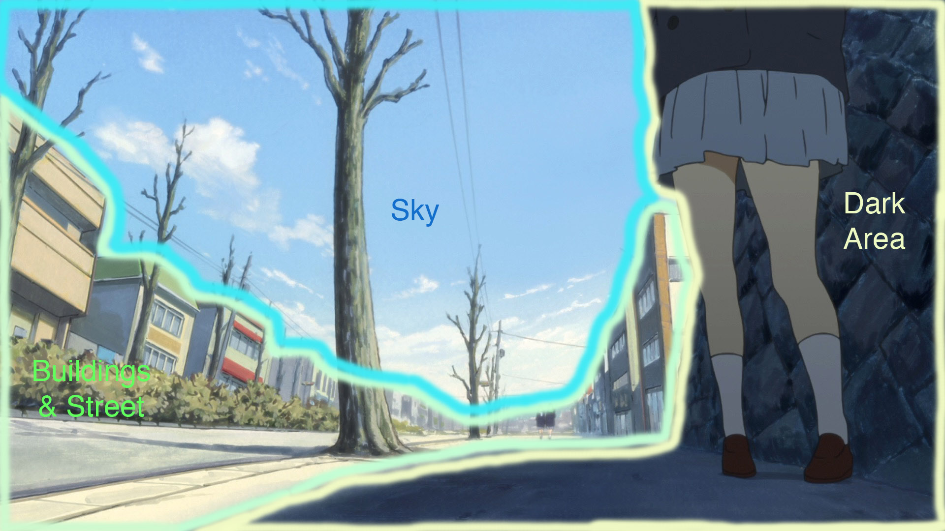
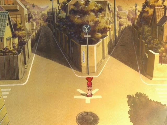
Typically, animation folks use the word “staging” to refer to how static visual elements are designed and composed within a shot. The basic staging of a scene is usually determined in the storyboards, which are a series of rough drawings representing each shot. The layout artist then refines the storyboard drawings into the exact backgrounds, camera angles, and character positions. (In Japan, the animator of the scene sometimes doubles as the layout artist.) Each element should direct the viewer’s attention towards the main point of the scene. The following image from K-On! (storyboarded by Naoko Yamada and Noriyuki Kitanohara) is a great example of a well-staged shot.

To understand the staging in a picture, it helps to examine its composition, or overall structure. The K-On! shot can be broken down into three basic areas: the street and buildings on the left, the sky, and the dark area on the right. Each region is separated by contrasts in color, lighting, and detail. The trees and power lines break up the pattern to prevent monotony, but not so much that they overwhelm the larger forms. The characters in the far background are the focus of the image, and so they are framed by the buildings, shadow, and large tree. Note how the character in the foreground also helps frame the central area; characters, objects, and background elements can all be worked into the composition. This clear, balanced structure makes the shot aesthetically pleasing and easy for the viewer to read.
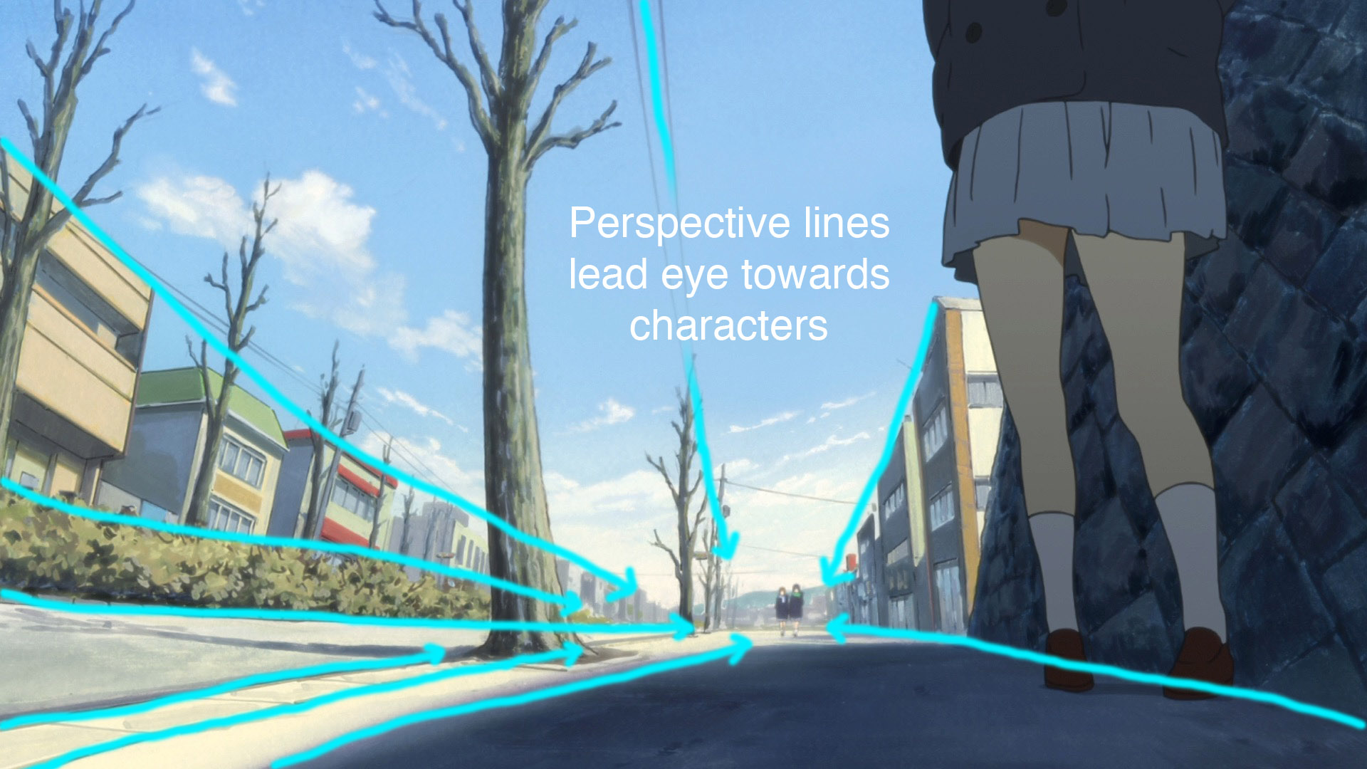
The shot also takes advantage of perspective. You can see that the streets, trees, power lines, and tops of the buildings all follow perspective lines as they recede into the distance. The distant characters are situated at the vanishing point, where the perspective lines appear to converge. Just about all of the background elements inevitably lead your eye towards the characters.
You can further divide the image into positive and negative spaces. Positive spaces are the subjects of a picture, which generally stand out with vivid colors and more details. Negative spaces are the areas around the subjects, which tend to be have neutral colors and fewer details. In the K-On! image, the buildings, foliage, and characters make up the positive space, while the sky, sidewalk, and street constitute the negative space. The girl in the foreground is less detailed than the surrounding brick wall, but her flat, brighter colors provide enough contrast. Negative spaces have several functions: they help draw your eye towards the subjects of the picture, and make the subjects easier to read in silhouette. They can also form pleasing subtle shapes in themselves.


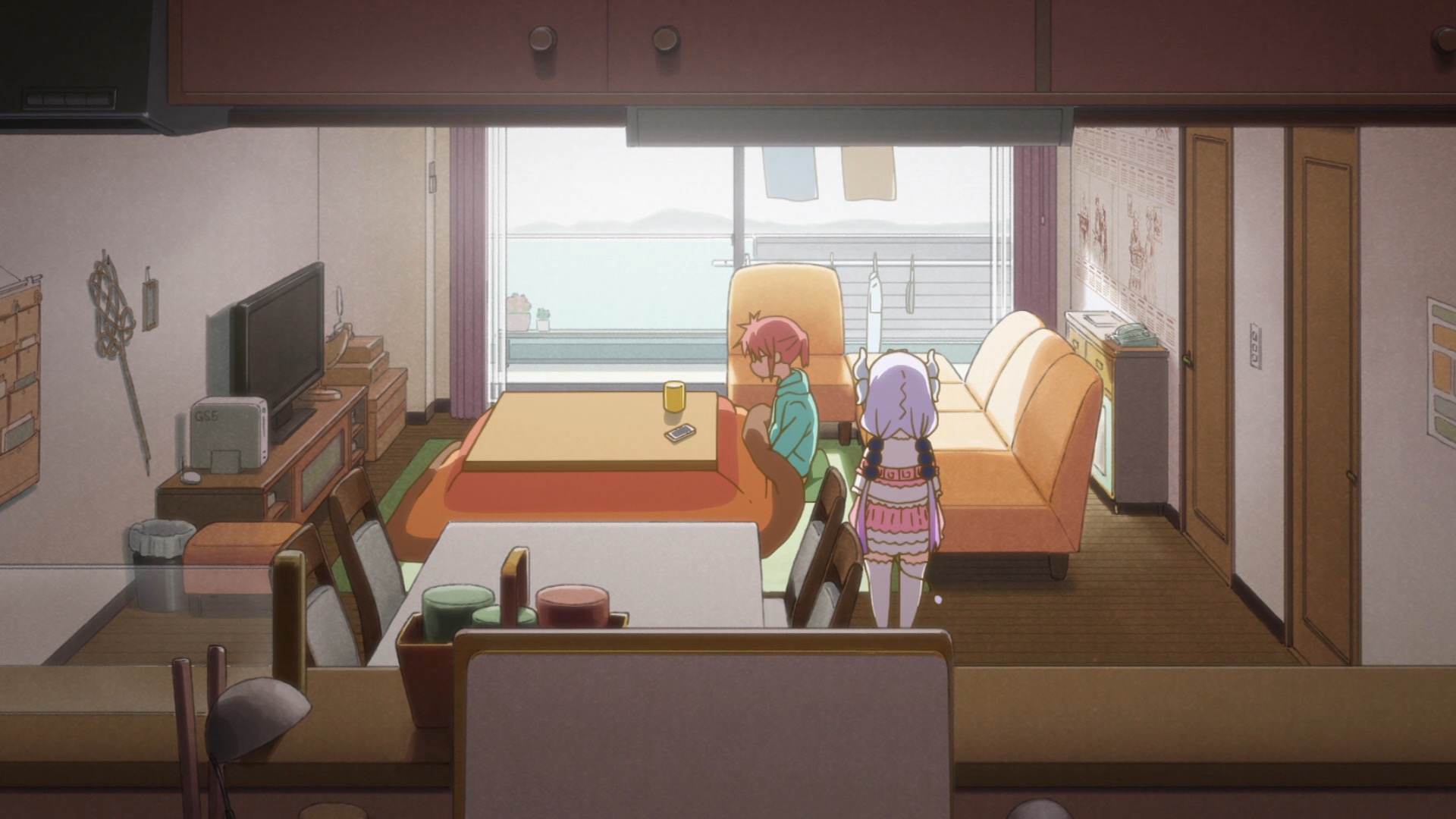
Staging isn’t limited to backgrounds—it also applies to moving drawings. Ideally, every frame should have the animated elements and backgrounds fit together in an organized composition. There should be enough room for the action to take place without getting bogged down in details, which is why negative spaces are necessary. In the following clip from Miss Kobayashi’s Dragon Maid (storyboarded by Taichi Ishidate and Taichi Ogawa), each shot gives the characters enough space for their walk cycles and poses to register clearly.
Poses are another important aspect of staging. Strong poses make an animated character more dynamic and expressive, as opposed to a character merely standing up straight. They are also more graphically appealing, as in the stylized Lupin III drawings below (by Yuzo Aoki).


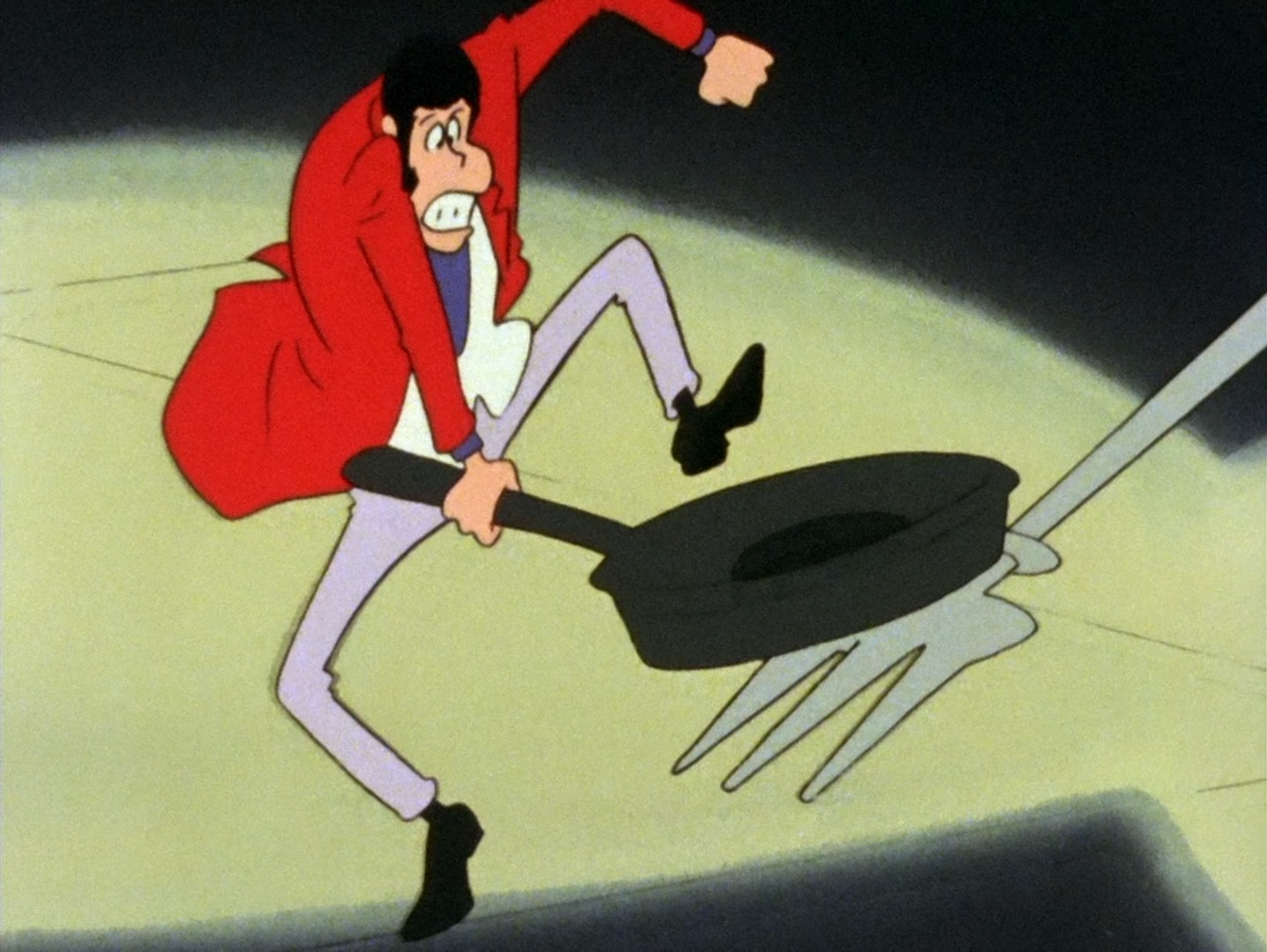
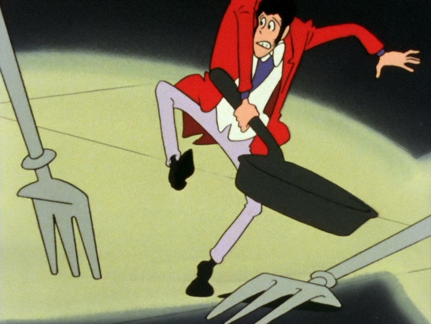
A good way to measure the strength of a pose is to shade it in so that only the silhouette is visible. You can convey a character’s attitude from their outline alone, which is especially useful in distant shots where they are drawn small. If a character’s hands and arms are placed in front of its body relative to the camera, the lines will be more cluttered and the pose will be harder to read. In the following image from Lupin III: The Mystery of Mamo, each part of the characters’ bodies is out in the open and separated by ample negative space.

Animated motion is part of staging as well. Each action should be clear, easy to follow, and relevant to the story point. Also, as Frank and Ollie suggest: “only do one thing at a time.” The viewer can’t completely focus on multiple actions that are happening at once. In this clip from Nichijou, each bit of motion is well-staged and distinct:
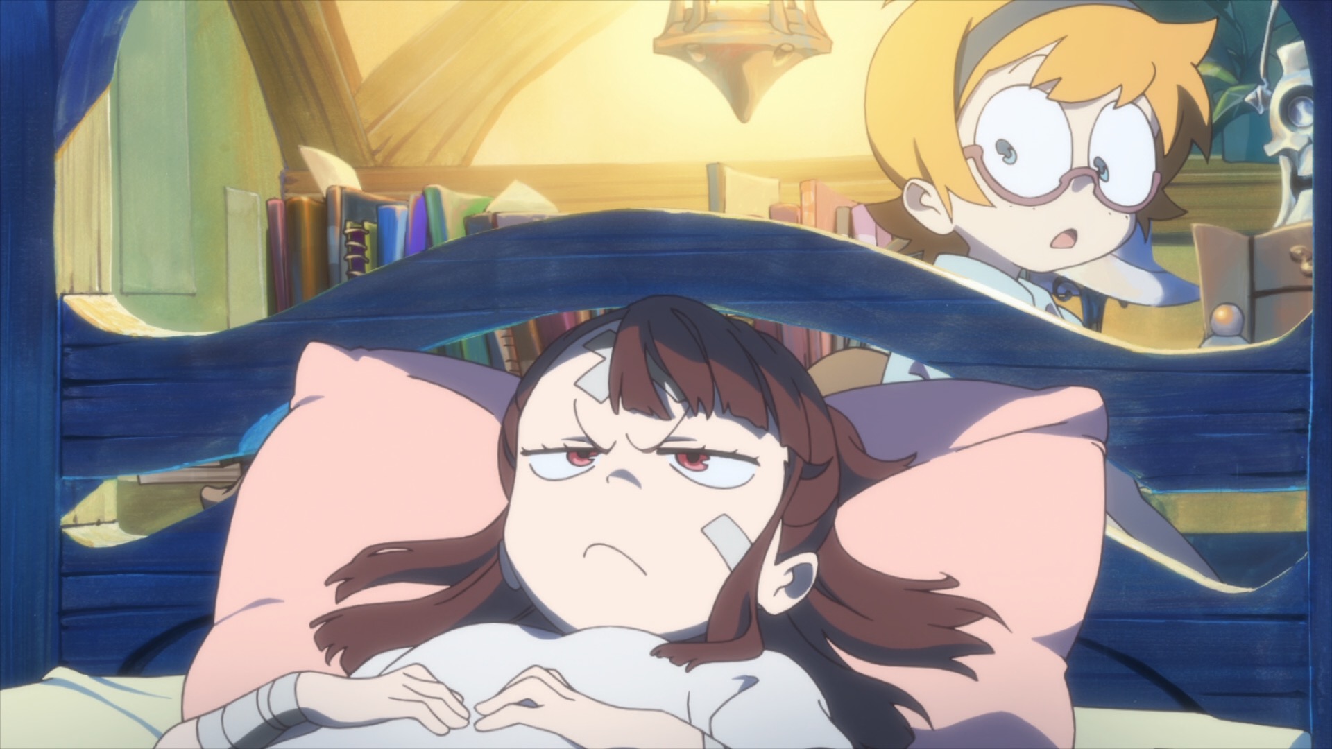
What if there are multiple characters moving on the screen? To keep the action clear, you can designate one character to be the focal point. The focus can switch to another character in the same shot, but only one character should carry the most weight at any given moment. In the below clip from Little Witch Academia, Akko is given the most movement and the strongest poses, while the other characters merely react to her with subtle motions and poses. Also note how their poses relate to each other: whenever Akko leans forwards, the other character lean back slightly.
Sometimes scenes call for lots of separate movement at once, with no single focal point. The following clip from Animal Treasure Island (animated by Hayao Miyazaki) is full of action across the screen, all with equal prominence and weight. Even so, the staging is great—precisely because it’s designed to let the eye wander. The shots are held long enough for the viewer to take in the action. Also, much of the animation is on a cycle, which allows you to see what’s happening in one area and move on to another. Most importantly, all of the action is unified by the single idea of a massive battle. The audience can immediately understand the story point, even if they don’t catch every specific motion.
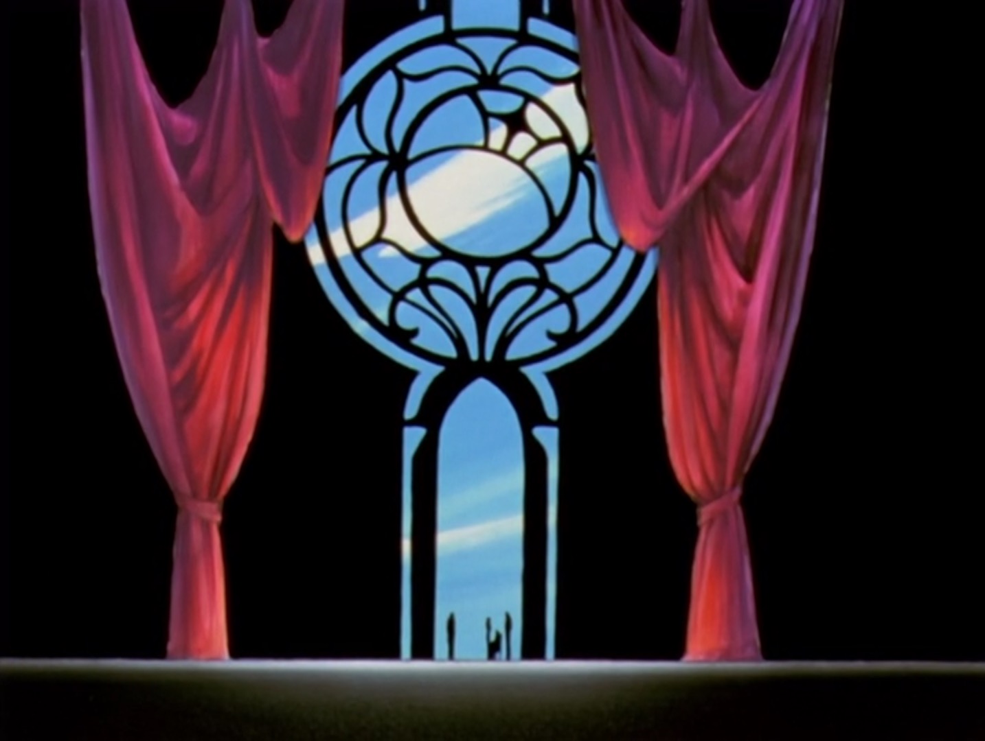
Color, lighting, and camera angles also fall under the category of staging. One of the great advantages of animation over live-action is that any shot or color is possible. Different hues, shades, and camera positions can evoke certain moods and add a vivid sense of texture and setting. An introduction to Japanese color styling and cinematography could probably be the subject of its own post.
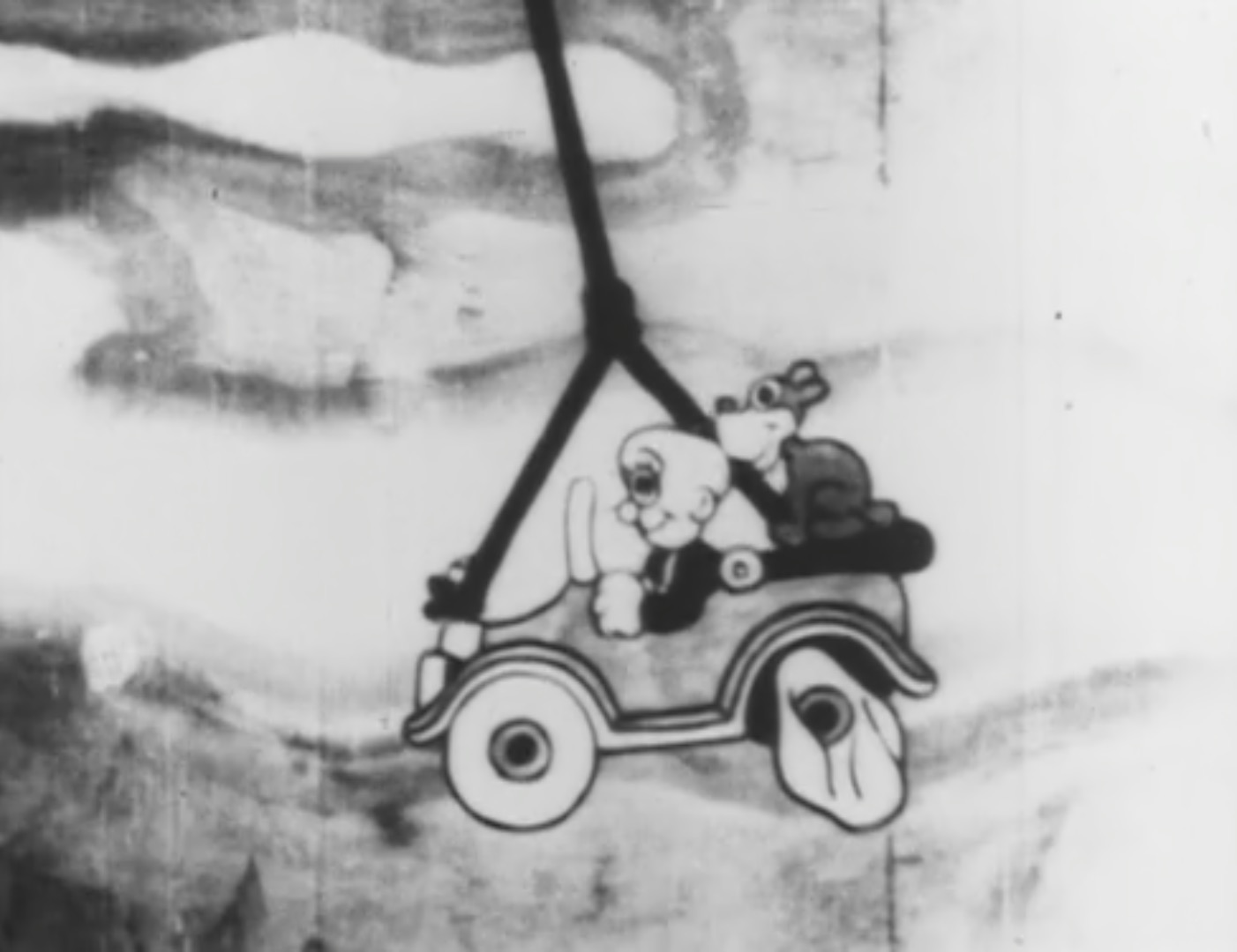
Early U.S. animation generally had flat staging. This was at least partly a practical choice: most cartoons were comedic short subjects that didn’t call for dramatic staging, and full animation in varying perspectives is an enormous technical challenge. U.S. animation also emphasized character acting, which is most easily portrayed in simple medium shots. The most prominent exceptions were the Disney feature films, which often dealt with moods besides straight comedy, and frequently employed interesting camera angles. At Warner Bros., directors Frank Tashlin and Chuck Jones also experimented with creative staging. However, flat shots were by and large the prevailing trend.
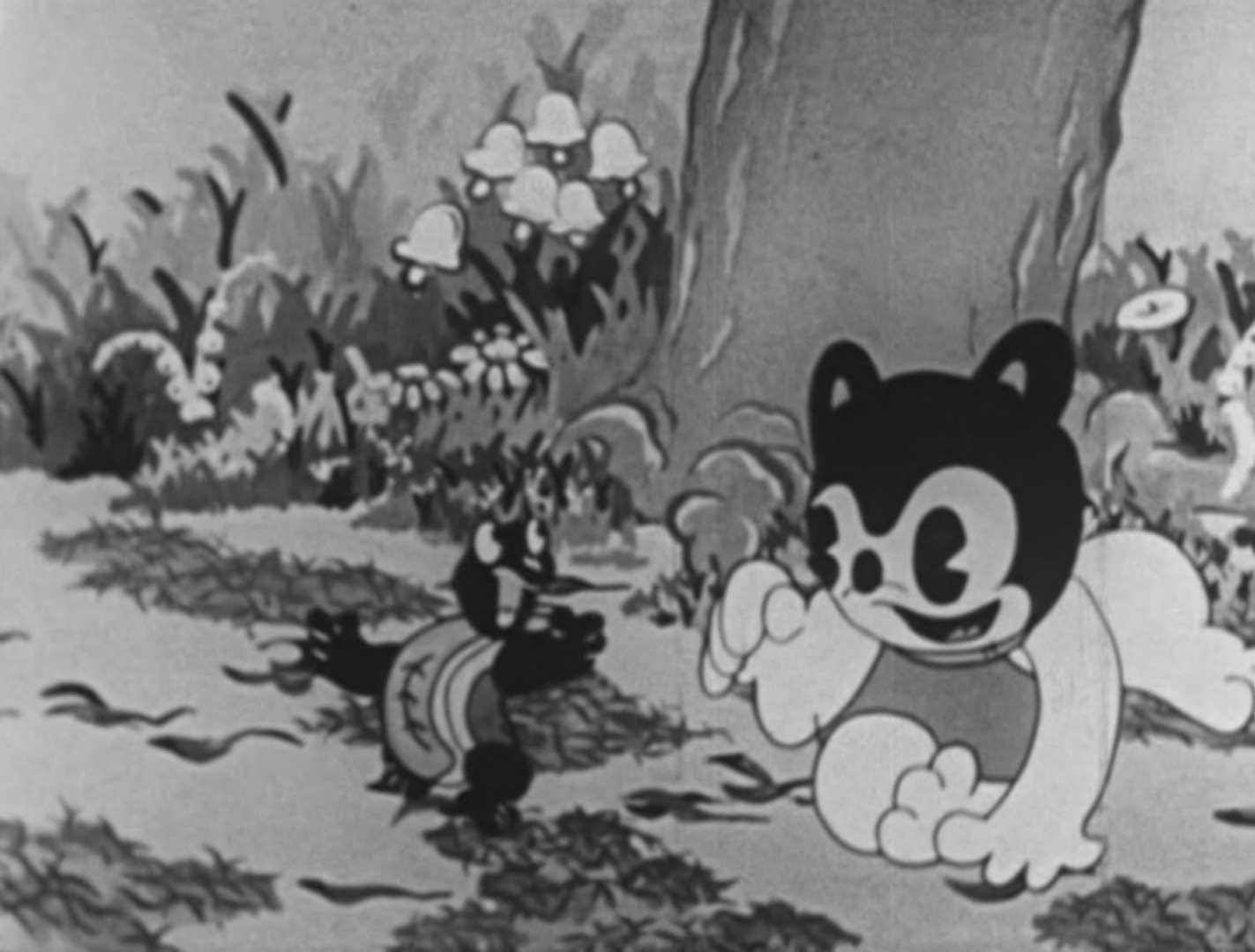
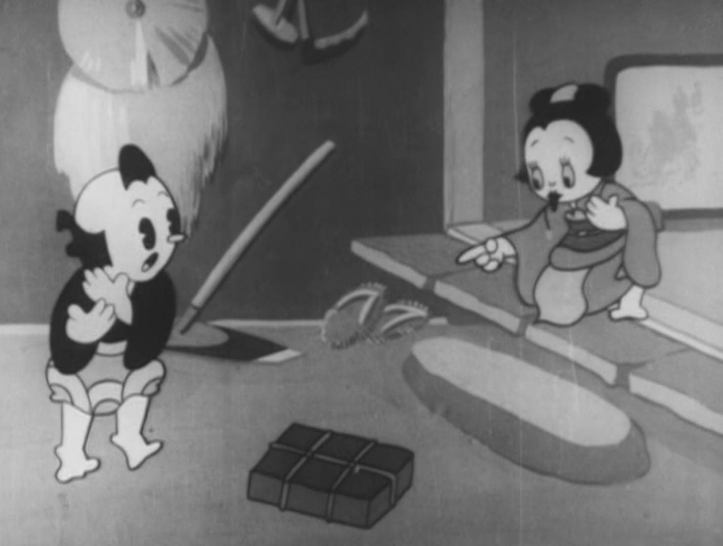
Early Japanese animation mostly followed America’s example in terms of flat staging. Of course, traditional Japanese art had already used two-dimensional compositions for centuries. Also, there wasn’t much precedent for anything else in cinema. From the 1910’s to the 50’s, staging in anime was more or less conservative.
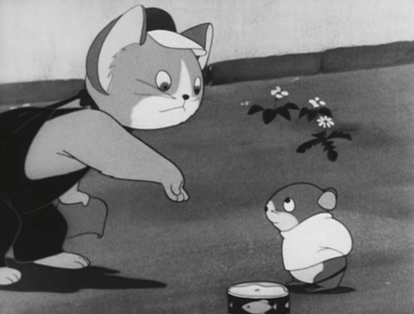
However, by the 60’s more varied and dynamic camera angles became increasingly common in anime. Part of this may be due to the advent of television: with the time and budget restraints imposed by the medium, animation had to be more limited, which enabled (or forced) artists to explore other avenues of creativity. Animation is expensive, but interesting compositions are cheap. The 60’s also saw a creative bloom in Japanese animation, with a new wave of independent animators who brought diverse artistic styles and influences. Osamu Tezuka was among the foremost indie animators, and his seminal show Astro Boy demonstrates a substantial use of dramatic staging in its very first episode. Other anime through the decade and onward continued to utilize varied camera angles, perhaps influenced by Astro Boy’s example. Meanwhile, U.S. TV animation largely stuck with its flat staging tradition.
Staging in anime has continually increased in creativity and sophistication (at least in terms of background layouts). Animation directors like Kunihiko Ikuhara, Tatsuya Oishi, Hideaki Anno, and Mamoru Hosoda can be recognized just from the way they compose shots. Though their styles differ, they all use the same principles of spacing, structure, and clarity.
Next: Straight Ahead and Pose to Pose!

Thanks! :>
LikeLike
Even now you can see the diference between the staging of american shows, like The Simpsons or, I don’t know, Phineas and Ferb. Their staging is almos all in 2D, an all they have is lateral move. In that aspect, anime is way more interest to watch
LikeLike
Great article!
LikeLike