Wave Motion Cannon is funded through public support! Please continue to support us!

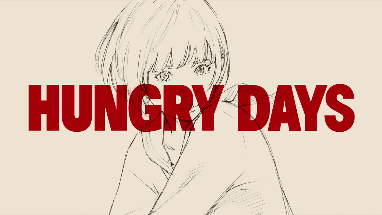
Hungry Days (Cup Noodle Commercial)
I’ve kept this video on loop ever since it came out, and the more I view this simple cup noodle commercial the more I fall in love with it.
Cup noodle company NISSIN launches a new advertising campaign annually, but this year’s caught the eye of animation fans for a good reason. The theme centered around youth, as beautifully penciled stills of young women stand against a colorful and ever-changing background. The contrast of motion is a powerful statement when regarding the idea of youth and growing up. In an almost profound manner, it represents the emotional clash of desiring to change yet feeling like you’re staying the same.
From what I’ve been able to gather, the directorial work and animation was completed by web-gen animator Masanobu Hiraoka. If there is a single word that adequately describes the man’s work it would be ‘metamorphosis’. Hiraoka is completely self taught, holding on to his high-school dream of becoming an animator since his graduation in 2006. His style extremely cerebral, focusing on the spontaneous appearance of shapes and carefully planned splashes of color. This normally prevents distinctive textures and details from forming, but the use of penciled line art in Hungry Days overcomes. Manga artist Eisaku Kubonouchi’s use of hatching and cross hatching techniques tricks the mind into assuming depth and said texture, striking a sharp contrast between the two techniques that can be likened to combining a sharp cheese with a carefully blended wine.


Our narrator is none other than the lovely Megumi Hayashibara (Rei Ayanami, Faye Valentine, Lina Inverse). She provides us with the narrative structure. Understanding that the theme of the video was youth, I got in touch with my translator friend arashiyama to help me translate it. Hayashibara speaks the words:
Time after-school. Unrequited love. Confession. Diploma.
‘Youth’ is written (with the kanji of) ‘Blue Spring’ It’s blue, hot, and meaninglessly all-consuming. In the year 2017, a youth that nobody yet knows begins.
Hungry Days: Instant noodles.
During our conversation, arashiyama added a few footnotes to the translation that bring a sort of depth to this simple cup noodle commercial. He says:
[青春 = youth = literally ‘green/blue Spring’. The reason why it’s ‘green/blue’ is because Japan did not originally perceive the difference between the two colors. The lack of a distinction prevails today to a certain extent, e.g. in traffic light colors, the ‘green’ is still referred to as ‘青’ even though the word for green is ‘緑’. Otherwise, 青 normally means ‘blue’, as in 青空 (blue sky). It is often also deployed metaphorically. 青春 (Aoharu) is also a popular name, and could refer to the character in the commercial.
(Regarding the line “In the year 2017, a youth that nobody yet knows begins.”) …I opted for a more literal translation than the one in the Youtube video. The logical implication of my translation is that the company wants you to ‘watch this space’, hence ‘witness this blue spring unfold’ – but I feel that goes further than I’m really comfortable with.
The vagueness and ambiguity of language allows for some metaphorical and philosophical readings of Hayashibara’s words, as arashiyama outlines above. But it’s the animation that capitalizes on these themes. Again I come back to the contrast in motion. Youth, embodied by the beauty of Kubonouchi’s characters, is fleeting. Images of flowers blooming not only resembles the feminine but also the forward motion of time.


Perhaps the most powerful visual statement is the moment where defined features become “meaninglessly all-consuming”. A feminine pair of eyes stares at us, sketched with a light and vitality brought out by the minute details of every eyelash, and stray bang. The flowing eruption of ribbon-esque red speaks to an emotion that is just below the surface. As the Youth turns away, individual lines become scribbles, which turn to harsh and bold marker streaks which blot out the screen. It is a visual representation of the spoken emotion that Hayashibara previously narrated: “meaninglessly all-consuming”.


This 30 second commercial might damn well be the best piece of animation I’ve seen this past season. It’s a beautiful representation of the synthesis of commercial intention and artistic integrity that I have come to love in anime. Hungry Days somehow manages to walk that line of unabashed advertisement yet maintain an air of melancholic thought with some measure of depth. I compared it to cheese and wine as if it’s some sort of highbrow animation project, but really, it’s much simpler than that. It’s just cup noodles.

I really like the analysis of these very short pieces of animation, since it requires a very thorough and careful reading of such fast-paced imagery, compared to more easily, context-filled pieces. I mean, it does as long as the visual presentation gives it all to convey as much as possible in these quick glances.
What I like here is that Masanobu Hiraoka’s effects animations are so incredibly dynamic in the way they literally dance and give you the timing of the scene, without losing the music tempo. This is especially good considering that, while everything is obviously fast, not all is equally fast.
And what I think is best represented here is the different dynamics of time. The girl constantly changes hairstyles and clothes, she grows (I believe the ribbon are her feelings “tightening up”, for whatever reason) and matures apparently in a fleeting and carefree way but when graduation hits she’s completely drown in applications, quick bursts of “wind”, as if she’s stuck on a loop of days that go by much faster than she can process, and the strong red shot is the breaking point after she manages to make a step forward and “go through” that cloud like the plane does.
LikeLiked by 2 people
That last part is an interesting question, is it in fact the same girl? Looking at the facial stricture for each, they’re similar, but some people have said they are the same and some side with that they aren’t (I personally dont think they’re the same gal). Regardless, the all are a standin for youth in Japan.
LikeLike